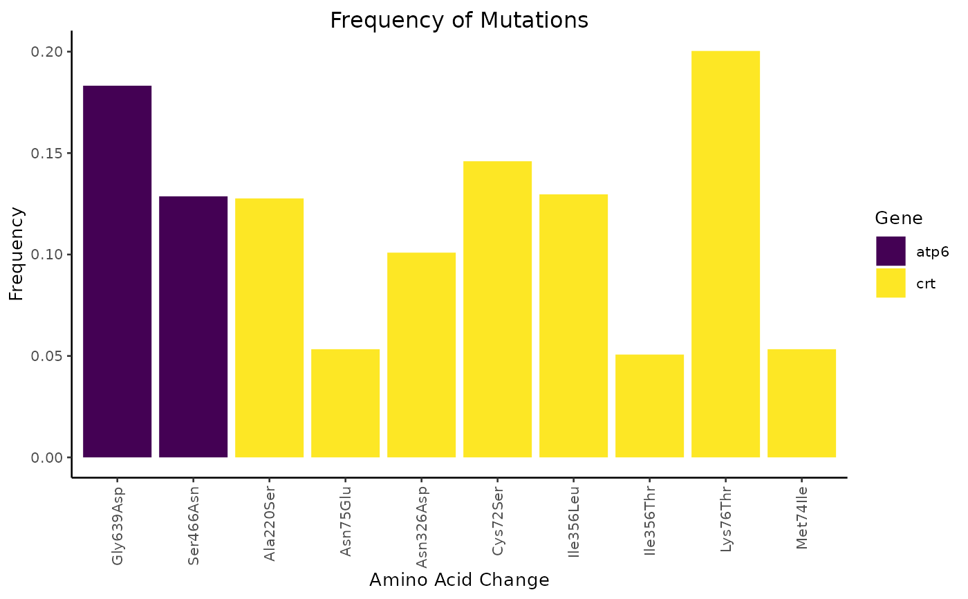
Plot the frequency of mutations generated by mutation_frequency().
The frequency is plotted on the y-axis and the amino acid change is plotted
on the x-axis. Data are grouped by the gene on which the mutation took place
and coloured according to their groupings.
Arguments
- data, object, x
An object of class
mut_freq. Derived from the output ofmutation_frequency().- ...
Other arguments passed to specific methods.
See also
mutation_frequency() for generating the data for plotting.
Examples
ref_file <- miplicorn_example("reference_AA_table.csv")
alt_file <- miplicorn_example("alternate_AA_table.csv")
cov_file <- miplicorn_example("coverage_AA_table.csv")
data <- read_tbl_ref_alt_cov(
  ref_file,
  alt_file,
  cov_file,
  gene == "atp6" | gene == "crt"
)
frequency <- mutation_frequency(data, 5)
plot(frequency)